With the Data Visualizer Tool, effortlessly pull data, apply filters, create interactive visualizations, and schedule automated email reports. Enhance these capabilities further with our AI Visualization tool, which guides you through creating specific insights like trends, distributions, or detailed data views.
Enabling the data visualizer in Aplos
The Data Visualizer is an add-on feature to your subscription. To enable the feature, navigate to the Subscription page under the Settings section. Select “Change Subscription,” and then add Data Visualizer. You can also disable the Data Visualizer from this screen.
Aplos Core is required to enable the Data Visualizer, and you must be an Administrator of your Aplos account to change the subscription. The monthly fee for the Data Visualizer is $25. This is in addition to your regular Aplos subscription.
If your account is in a contract, you can contact us to get access to the Data Visualizer.
Creating a report
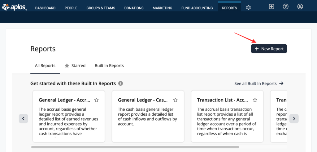
Navigate to the Reports tab in Aplos and click on the Data Visualizer button. If you do not see the Data Visualizer button, you will need to enable the feature using the instructions above.
From the Data Visualizer page, you can start with a built-in report or create a new one from your organization’s data.
Using built-in reports
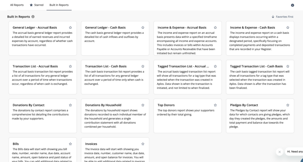
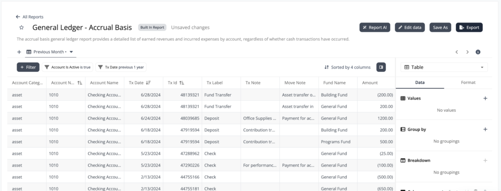
Built-in reports are pre-built templated reports that you can use to quickly preview data, or you can modify them to create your own custom reports. These pre-built reports will show columns for data that you would typically see in those reports and then allow you to add additional data to these reports as needed.
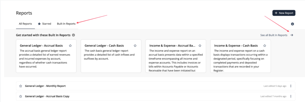
When you land on the Data Visualizer page, you will see a preview of some of the built-in reports. You can click on the previews to view those reports.
To view all the built-in reports, click on the Built In Reports tab above the list or click on “See all Built in Reports” on the right side of the page.
The built-in reports include:
- General Ledger – Accrual Basis
- General Ledger – Cash Basis
- Transaction List – Accrual Basis
- Transaction List – Cash Basis
- Tagged Transaction List (if you have tags enabled) – Accrual Basis
- Tagged Transaction List (if you have tags enabled) – Cash Basis
- Income & Expense – Accrual Basis
- Income & Expense – Cash Basis
- Donations by Contact
- Donations by Household
- Top Donors
- Pledges by Contact
- Bills
- Invoices
Note: The data powering the Data Visualizer is updated each morning, so you will see data for the previous day.
Creating new reports
To create a new report using your organization’s raw data, click “+ New Report.” These reports include all the information that powers the templated reports without filtering out any data.
Select a dataset to preview your data.
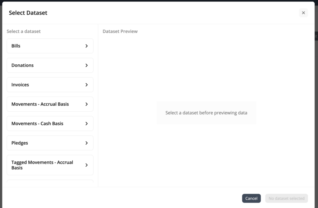
Datasets include:
- Movements – Accrual Basis
- Movements – Cash Basis
- Tagged Movements (if you have tags enabled) – Cash Basis
- Tagged Movements (if you have tags enabled) – Accrual Basis
- Donations
- Bills
- Invoices
- Pledges
These datasets will show you columns for all the data associated with these datasets. From there, you can hide and rearrange the data into a report that makes sense for you.
Generating data views
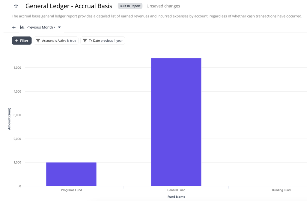
With the Data Visualizer, you can create different visual views of the data. The tool transforms financial data into clear charts, graphs, and dashboards to help you easily visualize trends, compare program performance, and deliver impactful insights to your stakeholders.
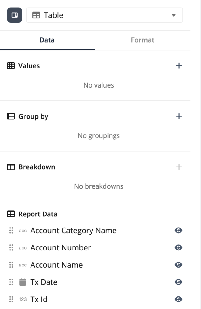
To do this, you will first select a templated built-in report or start with a data set to create a report. When viewing the report, you will see an option at the top of the Data Panel on the right-hand side that says “Table.” This is a dropdown that allows you to choose the way you’d like to view the data.
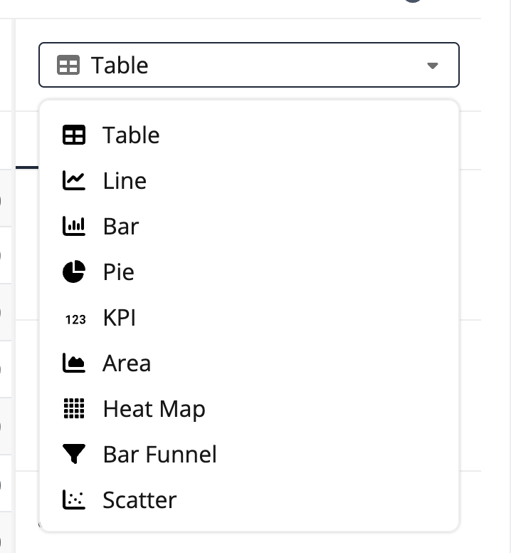
- If you select Line or Bar chart, you will need to choose which parts of the data you would like as your X-Axis and Y-Axis.
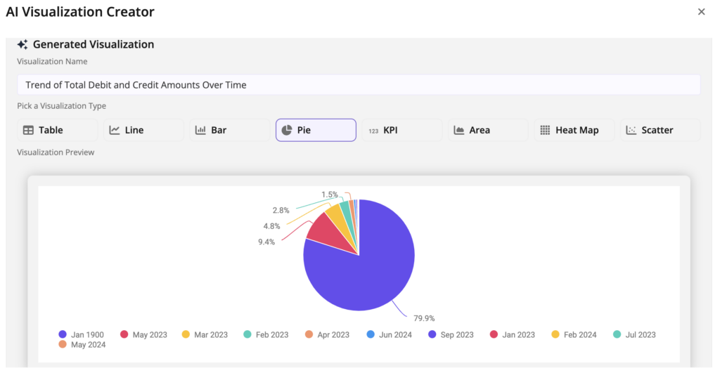
- If you select Pie chart, you will need to choose which values you’d like to see and how you would like them grouped.
- If you select KPI, you will need to choose which values you’d like to see.
You can also create tabs within a report to view the data in different ways all in one report. Click the plus sign (+) on the left side of the screen to add a tab. Click “+ Filter” on the left side of the screen to add your desired filters.
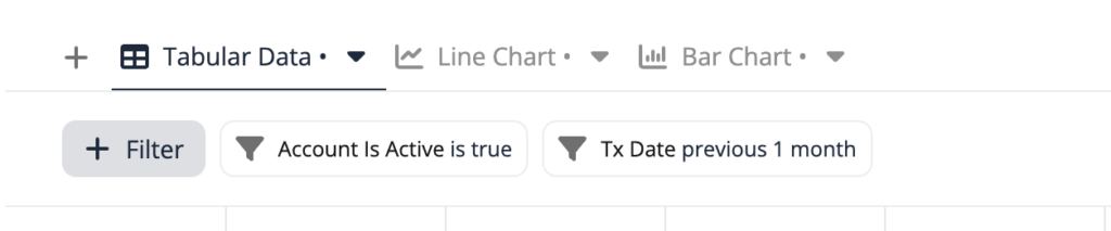
From the right side of the screen, choose the view you want displayed for each tab (i.e. table, pie chart, etc.), the data fields you wish to include, and the format.
Applying filters
Enhance your financial analysis by applying filters based on a range of data points, such as program funds, donor contributions, or project expenses. This focused approach ensures precision in decision-making and report accuracy.
Experience expert guidance (AI)
Receive support in report creation. This AI assistant guides you through creating reports by asking simple questions and generating visualizations. This tool simplifies deciding what data you want to see and creating visualizations, saving you time and effort.
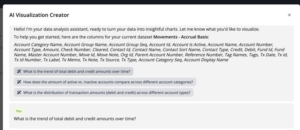
You can ask questions to get the visualization you want and the tool will clarify what you want to make sure it’s correct.
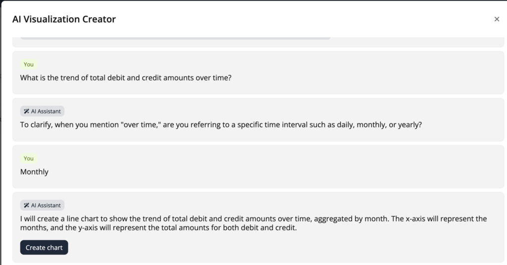
Then it will generate a visualization in the AI Visualization Creator based on the information you provide.
Schedule and share reports
Using the Data Visualizer, you also have the ability to schedule and share reports.
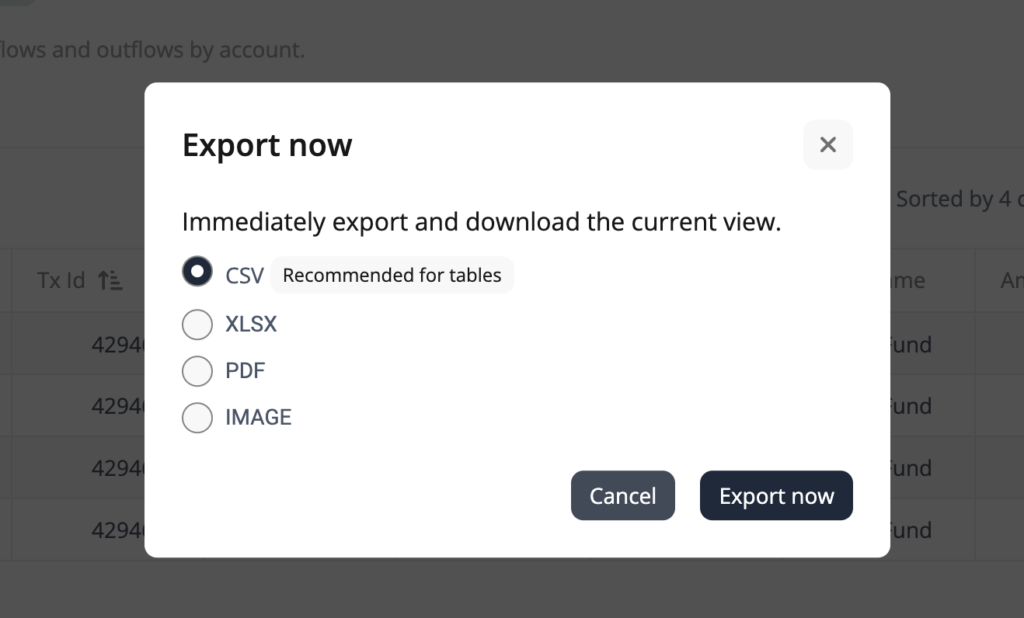
Exporting reports
You can export your reports to print them or attach them to an email.
Reports can be exported in the following formats:
- CSV (recommended for exporting tables)
- XLSX
- PDF (recommended for exporting graphs)
- IMAGE (recommended for exporting graphs)
To export a report, click the Export button on the right-hand side of the screen, and then click “Export now.”
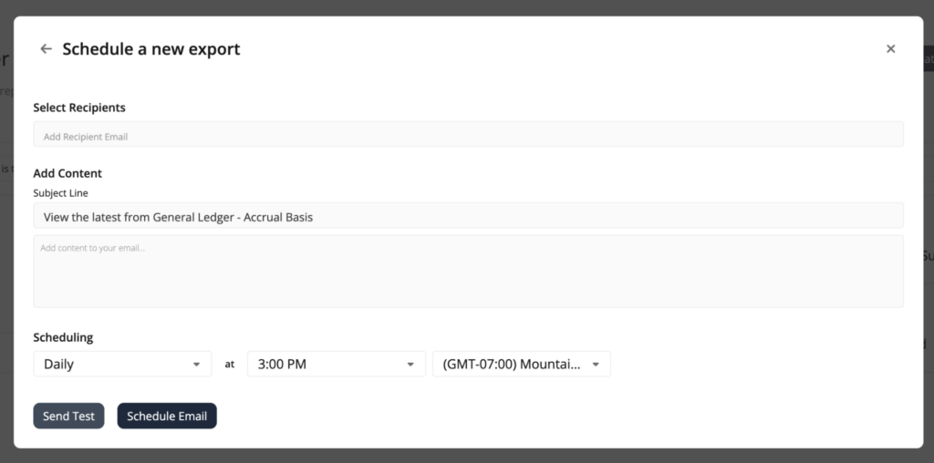
Scheduling automatic emails
Using the Export button, you also have the ability to set up automatic emails of the reports you have created. After you click “Export,” click “Schedule Export.”
This is a new feature that is specific to the Data Visualizer. You can add the emails of the recipients you want to receive this report. You also have the ability to customize the subject line and email content, and you can choose how often you want to send this report, including the time of day and time zone.
Recipients will receive all the different tabs that are included in the report.